Choosing the right banner image size on Squarespace can make the difference between a website that looks polished and one that feels unprofessional.
The banner is often the first thing visitors see, so it needs to be sharp, responsive, and visually balanced across devices.
Squarespace recommends uploading images that are at least 2500 pixels wide, which ensures your banner stays crisp on desktops, tablets, and mobile screens.
In this guide, you will learn the ideal Squarespace banner image dimensions, how to add a banner to your site, and design tips for creating a strong visual impact.
Different Squarespace Banner Sizes
Squarespace doesn’t use fixed banner dimensions. Instead, it uses a responsive design system, which means your banner image automatically resizes and crops based on the screen size and the section height you choose.

Here’s what that means in practice:
- Width: Squarespace recommends uploading images that are at least 2500 pixels wide. This ensures your banner looks sharp on large desktop screens, while smaller versions are automatically generated for tablets and phones.
- Height: The height of your banner isn’t fixed. It depends on the section settings (small, medium, large, or custom height) and how the image is cropped on different devices. A wider, landscape-style image generally works best.
- Automatic scaling: Squarespace automatically creates multiple image sizes (from 100px up to 2500px wide) and serves the right one based on the visitor’s device and screen resolution.
- Aspect ratio: Instead of thinking in terms of fixed sizes, focus on using a wide, horizontal aspect ratio (such as 16:9 or similar) to keep your banner visually balanced across devices.
What Is The Ideal Squarespace Banner Size?
While Squarespace offers various banner sizes, the ideal size for most situations is 2500 pixels wide. Here’s why:
- High-resolution displays: With more people using high-resolution screens, a 2500 pixel wide banner ensures your image looks crisp and clear on all devices.
- Future-proofing: As screen resolutions continue to improve, a larger banner size will help your site look great for years to come.
- Flexibility: A 2500 pixel wide image gives you more flexibility in cropping and adjusting the focal point of your banner.
- Automatic scaling: Squarespace will automatically scale down larger images for smaller screens, so you don’t have to worry about creating multiple versions.
When it comes to height, there’s no fixed ideal dimension. However, it’s generally recommended that your banner image be wider than it is tall. This ensures that your banner looks good on both desktop and mobile devices without excessive cropping.
Remember, while you can use images larger than 2500 pixels wide, Squarespace will automatically scale them down. Using unnecessarily large images can slow down your site and negatively impact your SEO, so stick to the 2500-pixel width for optimal results.
How To Add A Banner Image to Your Squarespace Website?
Adding a banner image to your Squarespace site is a straightforward process. Here’s a step-by-step guide to help you get started:
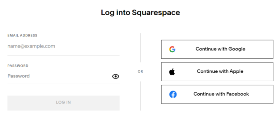
Step 1. Log in to your Squarespace account and navigate to the page where you want to add the banner.
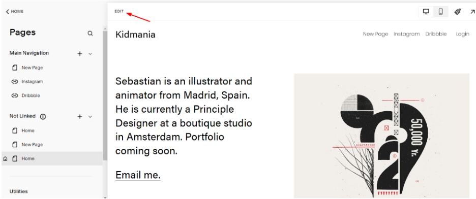
Step 2. Click on “Edit” to enter the page editing mode.
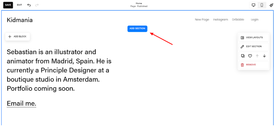
Step 3. Look for the “Add Section” button (Or a + icon) at the top of the page.
Step 4. From the options that appear, select “Banner” or “Page Header,” depending on your template.
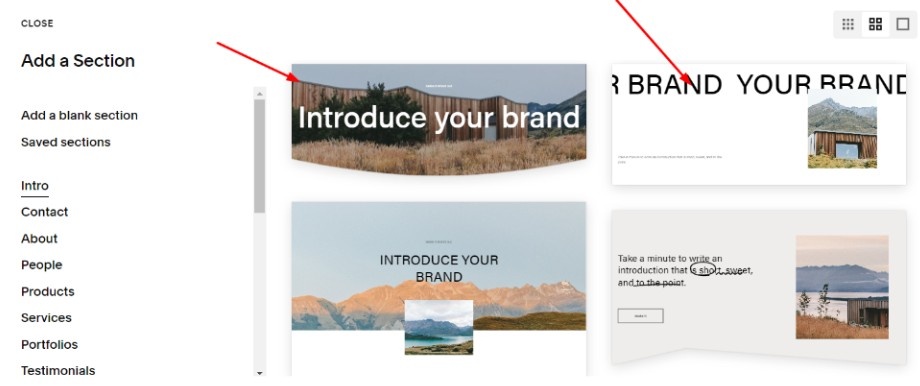
Step 5. Click on the placeholder image or the “Add Image” button to upload your banner image. Choose your image file from your computer and upload it to Squarespace.
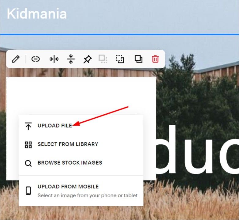
Step 6. Once uploaded, you can adjust the focal point of the image by clicking and dragging the circular icon that appears over the image.
Step 7. If your template allows it, you can add text overlays or buttons to your banner using the editing tools provided. Adjust any additional settings, such as banner height or overlay opacity, using the style editor.
Step 8. Click “Apply” or “Save” to confirm your changes.
Preview your site to ensure the banner looks good on both desktop and mobile devices. Remember, the exact steps might vary slightly depending on your specific Squarespace template, but this general process should work for most sites.
To avoid manual efforts, you can use Squarespace’s AI website builder to create and edit beautiful banners.
Best Tips To Design Your Squarespace Banner
Now that you know how to add a banner and what size to use, let’s explore some tips to help you create a stunning banner that captures attention and enhances your site’s design:
- Keep it simple: Don’t overcrowd your banner with too many elements. A clean, uncluttered design often has the most impact.
- Use high-quality images: Ensure your banner image is sharp, well-lit, and relevant to your brand or content.
- Consider your color scheme: Choose colors that complement your overall site design and brand identity.
- Think about text placement: If you’re adding text to your banner, make sure it’s easily readable and doesn’t clash with the background image.
- Create contrast: Use contrasting colors or overlay effects to make your text stand out against the background image.
- Optimize for mobile: Remember that your banner will look different on mobile devices. Test how it appears on various screen sizes and adjust accordingly.
- Use animation sparingly: While Squarespace animated banners can be eye-catching, use them judiciously to avoid overwhelming your visitors.
- Experiment with layouts: Try different banner layouts, such as split-screen designs or asymmetrical compositions, to add visual interest.
Here are some successful Squarespace website examples that will inspire you to design beautiful and creative banners for your website.
Conclusion: The ideal Squarespace Banner Image Size Is 2500 Pixels
Choosing the right banner image size for your Squarespace website is crucial for creating a visually appealing and professional-looking site. While Squarespace offers several size options, the ideal banner width of 2500 pixels ensures your image looks great across all devices and screen resolutions.
Remember to keep your banner design simple yet impactful, use high-quality images, and align the design with your brand identity. By following the steps outlined in this guide and implementing our design tips, you’ll be well on your way to creating eye-catching banners that make a lasting impression on your site visitors.
Don’t be afraid to experiment with different designs and layouts to find what works best for your specific needs. With a little creativity and attention to detail, your Squarespace banner can become a powerful tool for engaging your audience and showcasing your brand.
