Looking for website design inspiration in 2025? This curated list of the 50 best Squarespace websites showcases just how creative and versatile the platform can be.
From bold e-commerce brands to sleek portfolios and service sites, each example highlights unique features, layouts, and design choices that push boundaries.
Whether you’re a beginner or a seasoned Squarespace user, these sites will spark fresh ideas and help you unlock the full potential of your own website.
Dive in to discover what makes these standout Squarespace websites so effective—and how you can do the same.
Quick Table: Top 10 Squarespace Website Examples
Before we dive into the detailed list, here’s a quick overview of 10 standout Squarespace websites. These examples represent various industries and design styles, showcasing the platform’s versatility and the creative potential it offers users.
| No. | Website Name | Category | Description |
|---|---|---|---|
| 1 | Spark Plugin | Edgy | Showcases various Squarespace customizations |
| 2 | Bloomington Villas | Edgy | Luxury vacation resort with stunning visuals |
| 3 | Pivot Point | Edgy | Marketing website with a unique color scheme |
| 4 | Insaan Group | Minimalistic | Gentle, unobtrusive design with animated elements |
| 5 | Monarch Athletic Club | Services | Clean, professional design with inspirational elements |
| 6 | Brooklynn Landis | Portfolio | Personal branding and showcasing skills visually |
| 7 | MyForest Foods | Commerce | Sustainable food brand with natural tones |
| 8 | Square Launcher Golf | Commerce | Professional golf product with impressive credentials |
| 9 | Balazs Fodor Photography | Minimalistic | Showcases stunning ocean photography |
| 10 | Planner Girl Hub | Edgy | Personal branding and showcasing portfolio |
Now let’s understand detailed examples of 50 inspiring Squarespace websites:
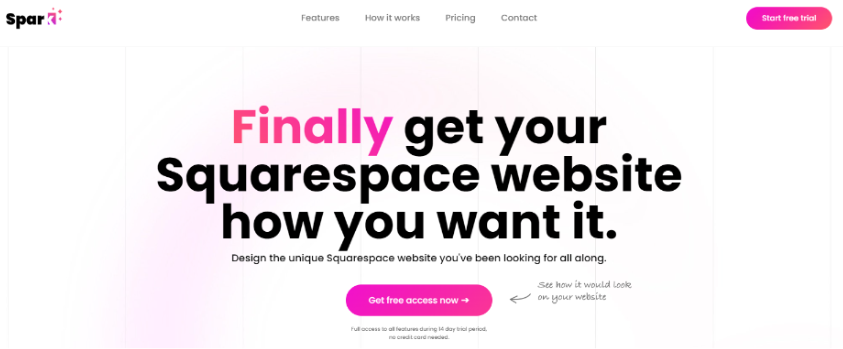
1. Spark Plugin
| Category | Edgy |
| Learning | Demonstrates creative ways to enhance Squarespace sites |
Spark Plugin’s website showcases various Squarespace customizations, making it an excellent resource for inspiration. The animated gradient heading effect is a standout feature, demonstrating the plugin’s capabilities. Visitors can learn about creative ways to enhance their Squarespace sites.
2. Bloomington Villas
| Category | Edgy |
| Learning | Importance of high-quality visuals in the hospitality industry |
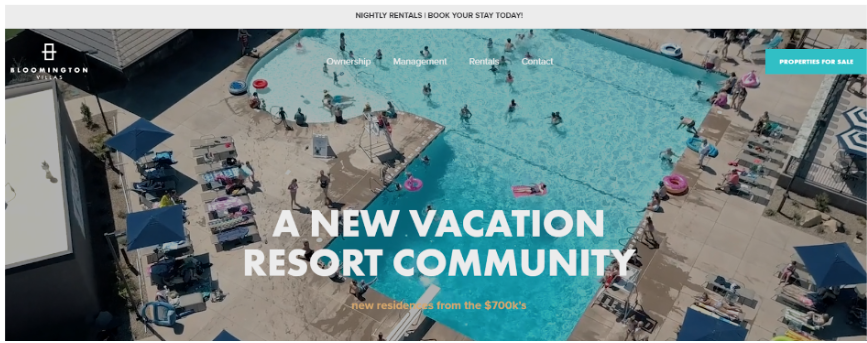
Bloomington Villas’ website effectively sells vacation resorts through stunning photos and videos. The use of carousels creates an engaging browsing experience. This example teaches the importance of high-quality visuals in the hospitality industry.
3. Pivot Point
| Category | Edgy |
| Learning | How to create a memorable brand identity in a crowded market |
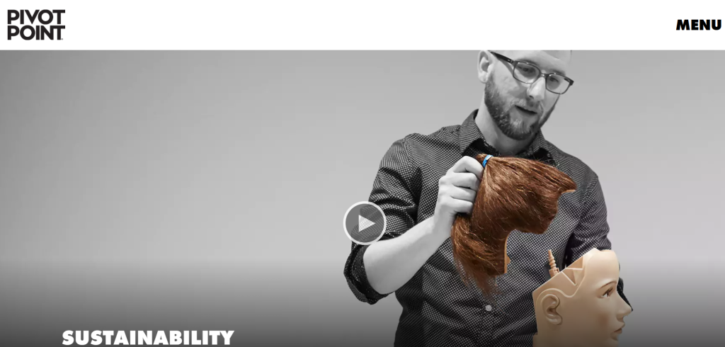
Pivot Point’s marketing website stands out with its bold color scheme and high-contrast visuals. The electric blue and purple gradients make a strong first impression, while the overlapping sections and clean fonts guide the visitor’s eye effortlessly. The site uses animated transitions and scroll effects that add flair without affecting usability.
4. Insaan Group
| Category | Minimalistic |
| Learning | How minimalism can effectively communicate a brand’s message |
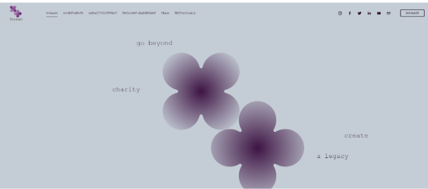
Insaan Group’s website uses a gentle, unobtrusive design with softly changing colored backgrounds and subtly animated symbols. The fading background effect creates a calming atmosphere. This example shows how minimalism can effectively communicate a brand’s message.
5. Monarch Athletic Club
| Category | Services |
| Learning | Balancing professionalism with motivation in service-based websites |
Monarch Athletic Club’s website features a clean, professional design with inspirational elements. The outlined text headers create a dynamic look that is perfect for a gym chain. This example demonstrates how to balance professionalism with motivation in service-based websites.
6. Brookelynn Landis
| Category | Personal, Minimalistic |
| Learning | Importance of personal branding and showcasing skills visually |
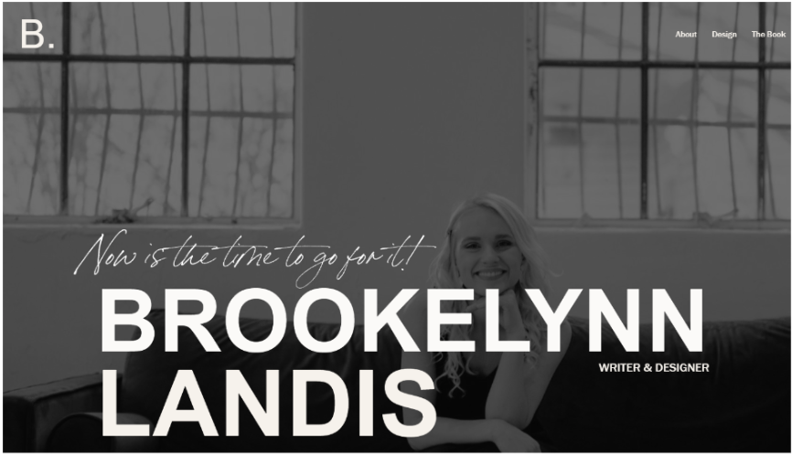
Brookelynn Landis’ web design portfolio showcases a crisp, clean design. The animated image shapes effectively highlight her work. This site teaches the importance of personal branding and showcasing skills in a visually appealing manner.
7. MyForest Foods
| Category | Commerce |
| Learning | Aligning website design with brand values and product offerings |
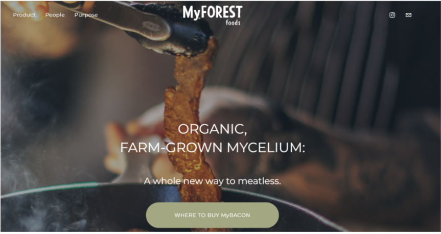
MyForest Foods’ website uses natural muted tones to reflect its sustainable food products. The animated buttons encourage customer interaction. This example shows how to align website design with brand values and product offerings.
8. Square Launcher Golf
| Category | Commerce |
| Learning | Power of social proof and creative design elements in product marketing |
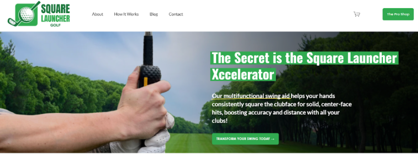
Square Launcher Golf’s website immediately establishes credibility with impressive logos. The handwritten-style underlines draw attention to crucial headers. This site demonstrates the power of social proof and creative design elements in product marketing.
9. Balazs Fodor Photography
| Category | Minimalistic |
| Learning | Creating a compelling portfolio that lets the work speak for itself |
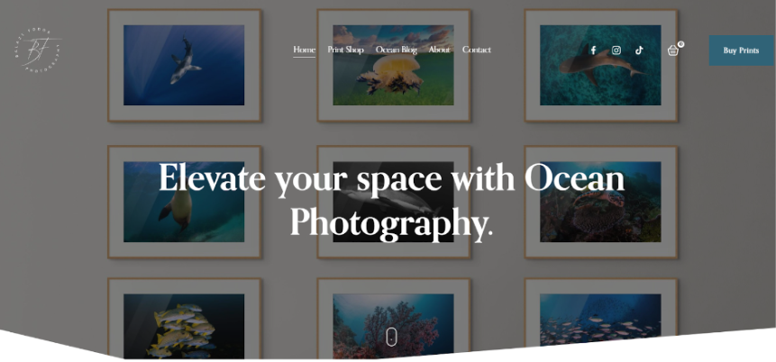
Balazs Fodor’s photography website uses a minimalist design to showcase stunning ocean images. The scroll indicator encourages visitors to explore the whole page. This site teaches how to create an effective portfolio that lets the work speak for itself.
10. Planner Girl Hub
| Category | Edgy |
| Learning | Understanding and catering to your audience’s preferences |
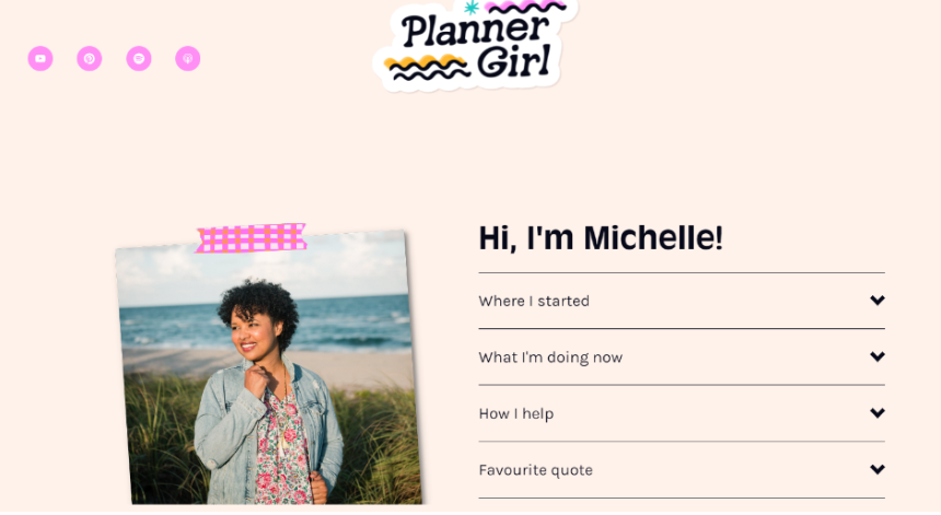
Planner Girl Hub’s website is bright and sparkly, appealing to its target audience. The handwritten accordion headers add a personal touch. This example demonstrates the importance of understanding and catering to your audience’s preferences.
11. Burningred
| Category | Services |
| Learning | Effectively displaying client work to attract new business |
Burningred’s digital marketing agency website features an impressive portfolio. The gallery shadow effect adds depth to project showcases. This site teaches how to display client work to attract new business effectively.

12. De Baere Bakery
| Category | Commerce |
| Learning | Creating an appetizing online presence for food-related businesses |
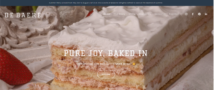
De Baere’s website puts its delicious products front and center with vivid photos. Animated social icons encourage social media engagement. This example shows how to create a flavorful online presence for food-related businesses.
15. DIFFA Dallas
| Category | Edgy |
| Learning | Creating impactful online presences for non-profits |
DIFFA Dallas’ charity website features a clean black-and-white design with red accents. The animated underline on call-to-action buttons draws attention. This site demonstrates how non-profits can create impactful online presences.

Squarespace discounts for non-profits are available, making it more accessible for these organizations to create professional websites.
16. Harper Sunday
| Category | Personal, Edgy |
| Learning | Creating a memorable personal brand through web design |
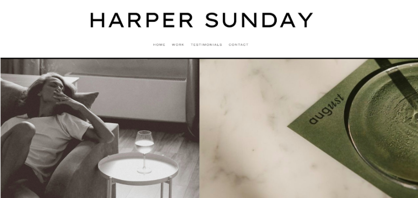
Harper Sunday’s graphic design portfolio site showcases a unique, eclectic style. The rounded text blocks add to the overall quirkiness. This example teaches how to create a memorable personal brand through web design.
17. Hype Network
| Category | Edgy |
| Learning | Creating a website that attracts like-minded individuals |
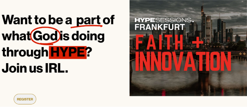
Hype Network’s website features bold typography and a striking black and red color scheme. The unapologetic design reflects the brand’s values. This example shows how to create a website that attracts like-minded individuals.
18. Live Bold Live Beautiful
| Category | Personal, Services |
| Learning | Creating a welcoming online presence for personal services |
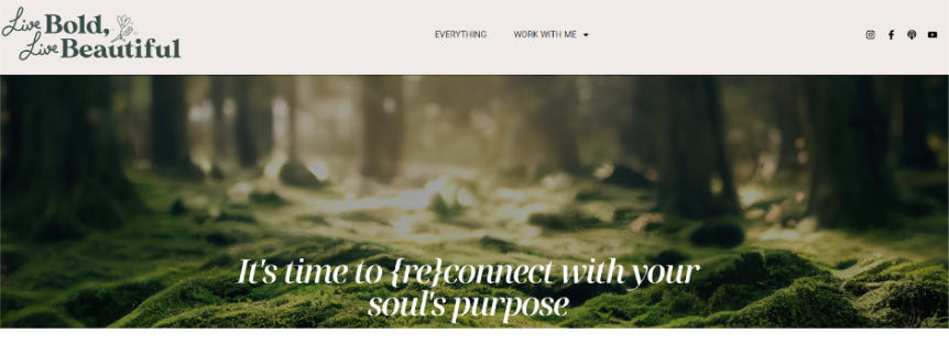
Live Bold Live Beautiful’s life coaching website uses a floral and friendly design. Underlined headers in complementary colors make sections stand out. This example demonstrates how to create a welcoming online presence for personal services.
19. Spera Special Events
| Category | Services |
| Learning | Creating an engaging online presence for event planning services |
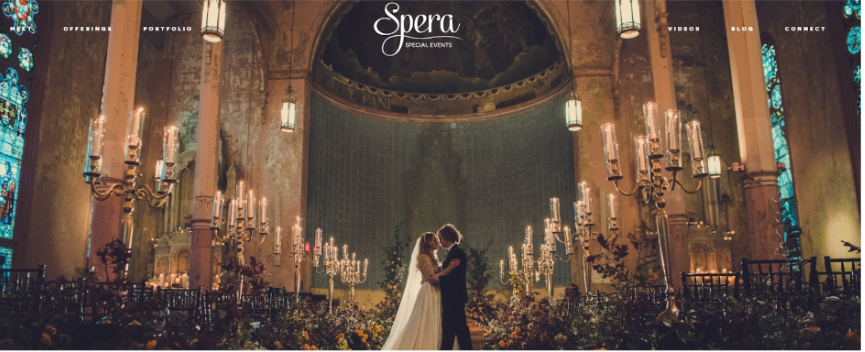
Spera Special Events’ website features inspirational photos and a stunning color theme. The testimonial slider effectively showcases client feedback. This site shows how to create an engaging online presence for event planning services.
20. Meletius Coffee Roasters
| Category | Commerce |
| Learning | Enhancing user experience through small design elements |
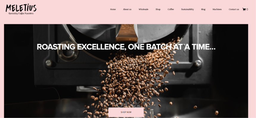
Meletius Coffee Roasters’ website pays attention to detail with line drawings and flashes of violet. The coffee cup cursor adds a cute touch. This example teaches how small design elements can enhance the overall user experience.
21. State Of Flow
| Category | Edgy |
| Learning | Creating visual interest through creative use of color and imagery |
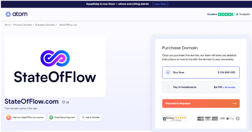
State of Flow’s website features a unique animated background image contrasting black-and-white photos. This site demonstrates how to create visual interest through creative use of color and imagery.
22. The Foundry Campus
| Category | Minimalistic |
| Learning | Creating a user-friendly site without sacrificing style |
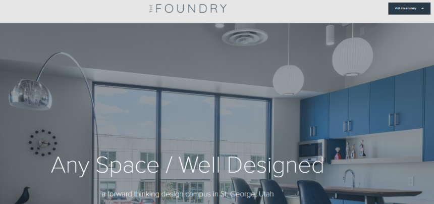
The Foundry Campus website is functional and well-thought-out, with excellent navigation. The card list feature effectively showcases partners. This example shows how to create a user-friendly site without sacrificing style.
23. Alix Turoff Nutrition
| Category | Personal, Services |
| Learning | Creating a vibrant online presence for health-related services |
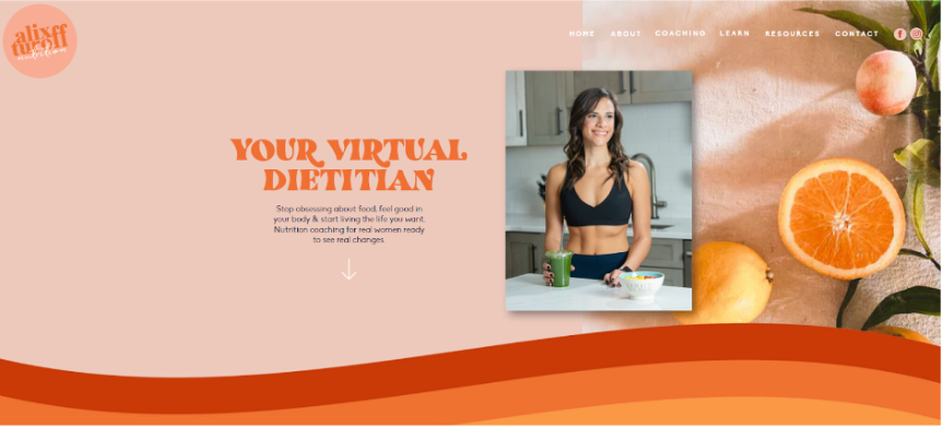
Alix Turoff Nutrition’s website features bright colors and retro-inspired typography. The rainbow dividers add a fun touch. This site teaches how to create a vibrant online presence for health-related services.
24. Marty Neumeier
| Category | Personal |
| Learning | Creating a powerful personal brand online |
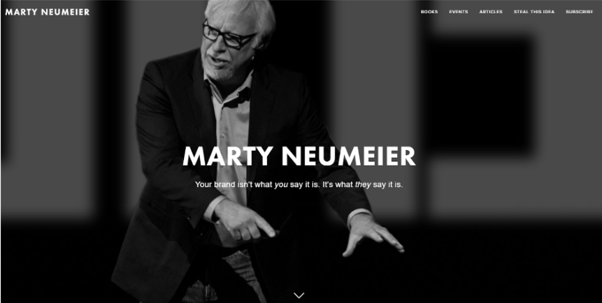
Marty Neumeier’s personal website uses a grayscale design to convey authority and impact. The minimalist approach focuses attention on his expertise. This example demonstrates how to create a powerful personal brand online.
25. Binging With Babish
| Category | Personal |
| Learning | Organizing and presenting large amounts of content effectively |
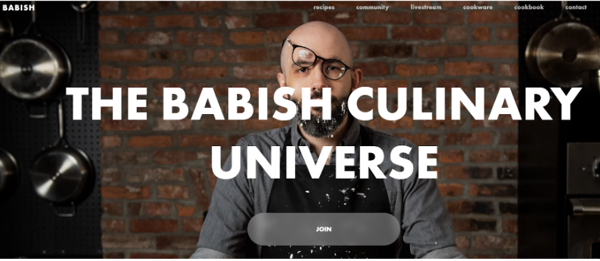
Binging with Babish’s website features fun content inspired by TV shows. The search bar improves navigation for the content-rich site. This example shows how to organize and present large amounts of content effectively.
For those inspired by these examples and considering creating their own Squarespace site, check out Squarespace Black Friday and Squarespace Cyber Monday deals, which can provide significant savings on subscriptions.
26. NEW INC
| Category | Minimalistic |
| Learning | Creating an effective online presence for educational programs |
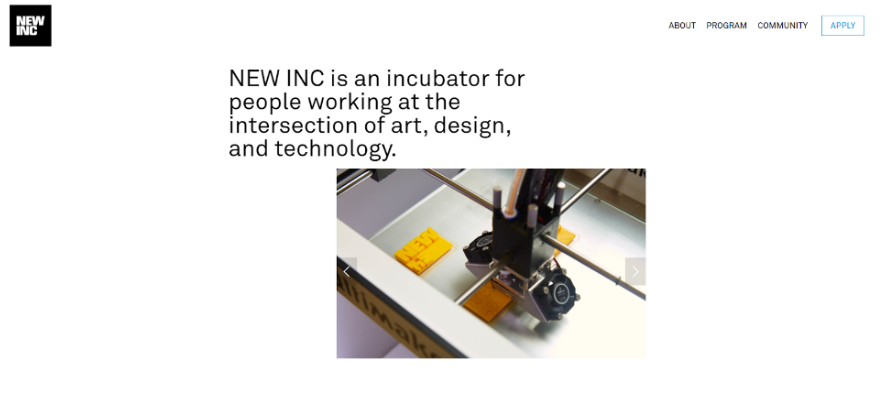
NEW INC’s website clearly communicates its incubator program’s purpose. The streamlined design makes information easy to find. This site teaches how to create an effective online presence for educational programs.
27. Fighting Eel
| Category | Commerce |
| Learning | Creating a user-friendly online shopping experience |
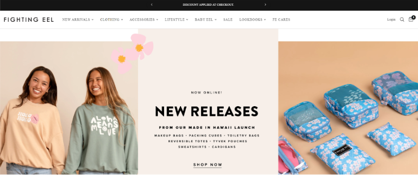
Fighting Eel’s e-commerce store features easy navigation and precise product categorization. The left-hand side menu improves user experience. This example demonstrates how to create a user-friendly online shopping experience.
28. Darren Booth
| Category | Personal, Commerce |
| Learning | Effectively showcasing visual art online |
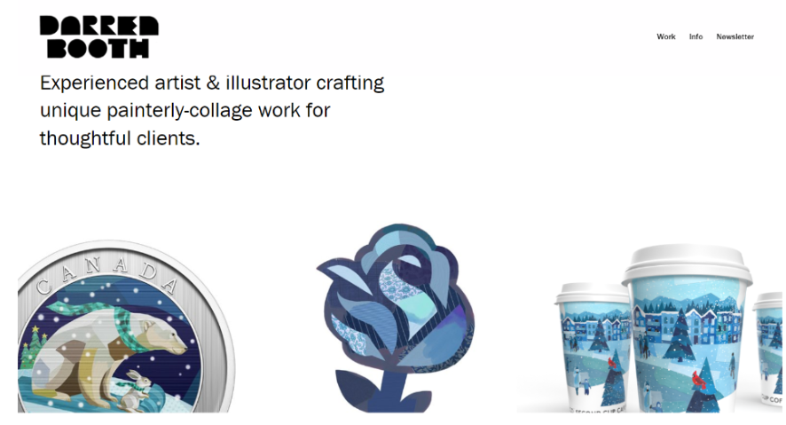
Darren Booth’s art website uses a clean design to highlight colorful artwork. The bundled layout in the work section creates visual interest. This site shows how to showcase visual art online effectively.
29. Blue Dog NYC
| Category | Minimalistic |
| Learning | Creating an online presence for restaurants |
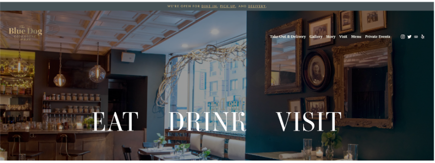
Blue Dog NYC’s restaurant website features mouth-watering photos and a detailed menu. The clean design lets the food take center stage. This example teaches how to create a flavorful online presence for restaurants.
30. Studio Joho
| Category | Personal |
| Learning | Creating an effective showcase for creative work |
Studio Joho’s design studio website prominently displays its portfolio. The left-hand navigation is an interesting design choice. This site demonstrates how to create an effective showcase for creative work.

31. Egg Shop
| Category | Commerce |
| Learning | Creating a multifunctional website for restaurants |
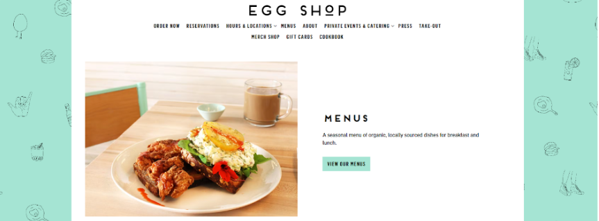
Egg Shop’s website combines e-commerce, menu display, and event booking. The food-themed background adds personality. This example shows how to create a multifunctional website for restaurants.
32. Altrock Surfaces
| Category | Commerce, Minimalistic |
| Learning | Making less exciting products look appealing online |
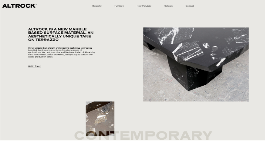
Altrock Surfaces’ website uses exceptional photography to showcase marble products. The clean design complements the products. This site teaches how to make even less exciting products look appealing online.
33. Daniel Arsham
| Category | Personal, Services |
| Learning | Creating a web presence that matches an artist’s unique vision |
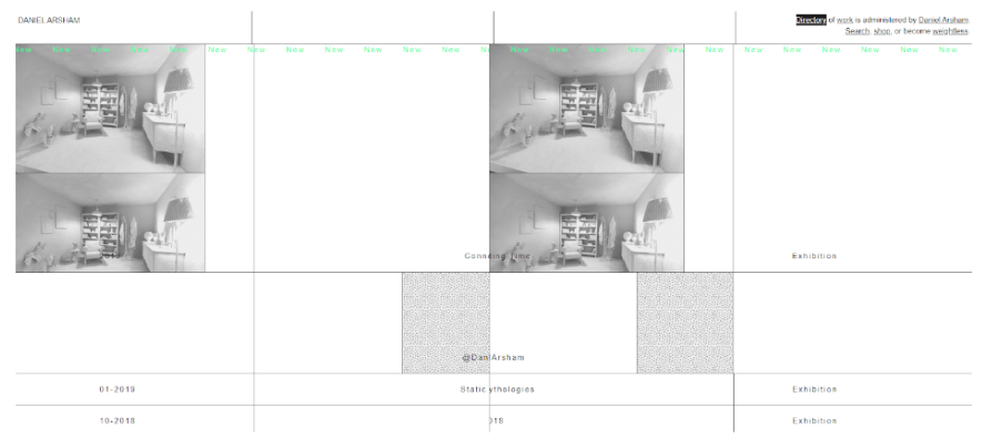
Daniel Arsham’s website features a chaotic design that reflects his artistic style. The unconventional navigation aligns with his target audience. This site shows how to create a web presence that matches an artist’s unique vision.
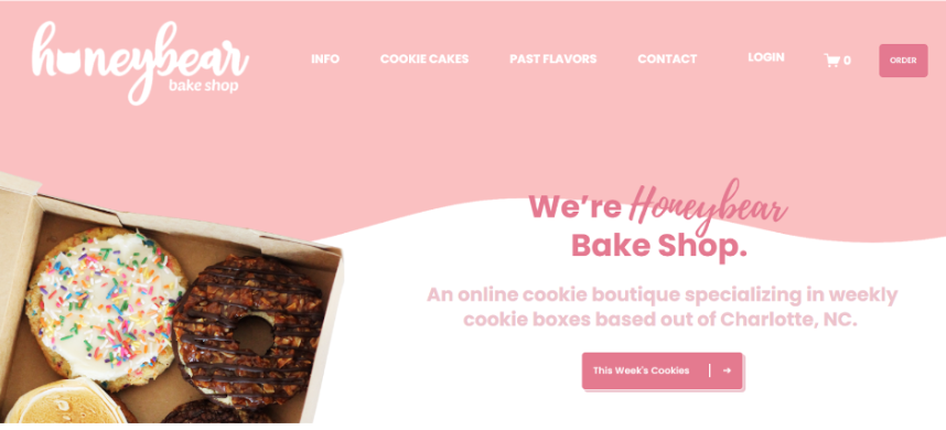
34. Honeybear Bake Shop
| Category | Commerce, Services, Edgy |
| Learning | Creating an enticing online presence for bakeries |
Honeybear Bake Shop’s website combines e-commerce and bakery services. The design likely reflects their award-winning cookies. This example demonstrates how to create an enticing online presence for bakeries.
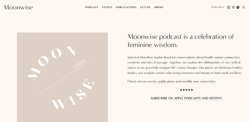
35. MoonWise
| Category | Commerce, Minimalistic |
| Learning | Creating a standout design within Squarespace’s framework |
MoonWise’s website features side-by-side sections for a unique layout. This design choice creates visual interest. This example shows how to create a standout design within Squarespace’s framework.
Squarespace offers various pricing options to suit different needs. You can find more information about Squarespace pricing here.
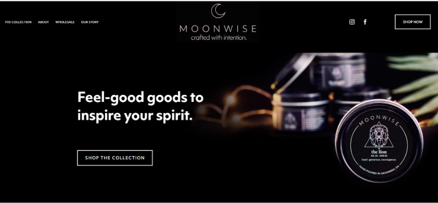
36. Moonwise Candles
| Category | E-commerce |
| Learning | Using Dark colors to create a mystery that matches the brand identity |
Shop Moonwise is made with Squarespace to sell healing crystals and zodiac candles. The dark webpage matches the brands’ identity and creates mystery and intrigue. This website has used Squarespace layouts to the fullest.
37. Powerhouse
| Category | Minimalistic |
| Learning | Creating a versatile yet polished web presence |
Powerhouse’s website features a light and clear design suitable for various industries. The animated card design adds professionalism. This example teaches how to create a versatile yet polished web presence.

38. Rachel Holly
| Category | Personal, Minimalistic |
| Learning | Using trendy color schemes effectively while maintaining a unique brand identity |
Rachel Holly’s website stunningly uses a popular beige, white, and black color palette. The minimalist approach creates an elegant and professional look. This example demonstrates using trendy color schemes effectively while maintaining a unique brand identity.

39. Tiny Coast Digital
| Category | Edgy, Services |
| Learning | Embracing current design trends while maintaining functionality |
Tiny Coast Digital’s website incorporates 3D design elements, creating a visually striking experience. The adaptive logo changes from dark to light to complement the vibrant color scheme. This site shows how to embrace current design trends while maintaining functionality.

40. Mike Foster
| Category | Personal, Commerce |
| Learning | Creating a dynamic personal brand website that stands out |
Mike Foster’s website cleverly uses backgrounds to create an overlapping effect. This design choice adds depth and visual interest to the site. The example teaches how to create a dynamic personal brand website that stands out.

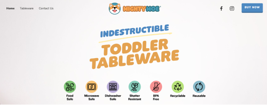
41. MightyMoe Kid’s Dinnerware
| Category | Commerce |
| Learning | Creating a child-friendly e-commerce site appealing to both kids and parents |
MightyMoe’s website is cute, colorful, and fun, reflecting its puppy cartoon mascot. Using card lists and carousels on the homepage showcases products well. This example demonstrates creating a child-friendly e-commerce site that appeals to kids and parents.
42. Equipe Planning Lawyers and Consultants
| Category | Services |
| Learning | Standing out in a conservative industry through bold design choices |
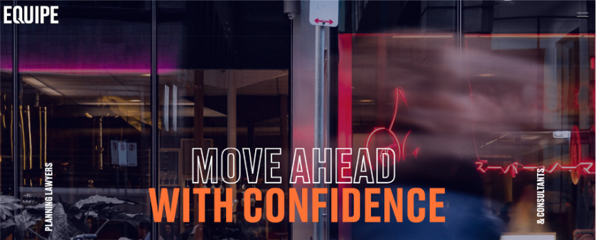
Equipe Planning’s website breaks from traditional legal site designs with a funky orange and blue color scheme and strong typography. The subtly animated backgrounds create visual interest. This site shows how to stand out in a conservative industry through bold design choices.
43. Lost Lore Tequila
| Category | Edgy |
| Learning | Creating an effective product showcase that aligns with brand values |
Lost Lore Tequila’s website emphasizes authenticity and tradition through old-style handwritten text and stunning photos. The clear and straightforward design lets the products speak for themselves. This example teaches how to create an effective product showcase that aligns with brand values.

44. Powder Me Pretty
| Category | Services |
| Learning | Creating a fun and inviting online presence for service-based businesses |
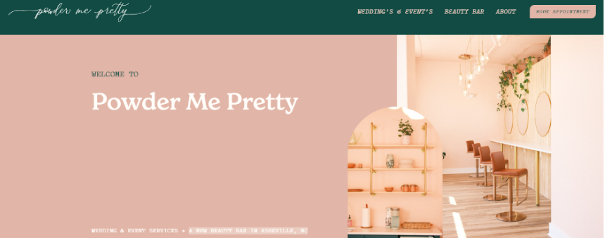
Powder Me Pretty’s beauty salon website features a cute and quirky color scheme with a chatty tone of voice. Removing image overlays allows visitors to see photos in their full beauty. This site demonstrates how to create a fun and inviting online presence for service-based businesses
45. Dominic Ruth
| Category | Personal |
| Learning | Creating a contemporary personal brand website that showcases creativity |
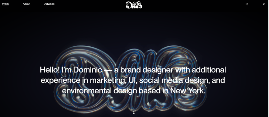
Dominic Ruth’s graphic design portfolio site features a fresh and minimalist design with modern use of emojis. The Glassmorphism header effect adds a cool, frosted-glass look. This example shows how to create a contemporary personal brand website that showcases creativity.
Watch for Squarespace promo code 2025 to save on your subscription.
46. Bon Appétit Magazine
| Category | Media, Food |
| Learning | Creating a content-rich website that’s both visually appealing and easy to navigate |
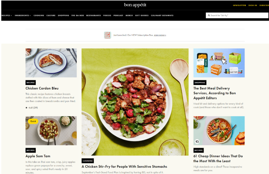
Bon Appétit’s website showcases how Squarespace can handle significant content while maintaining a modern design. The site effectively combines recipes, articles, and videos in a user-friendly layout.
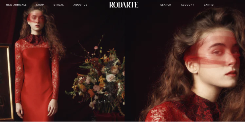
47. Rodarte
| Category | Fashion, Commerce |
| Learning | Balancing high-end fashion imagery with e-commerce functionality |
Rodarte’s website demonstrates how luxury fashion brands can use Squarespace to create an immersive brand experience while offering e-commerce capabilities. The dark, rich theme colors make this website beautiful to look at
48. The Prelude Project
| Category | Non-Profit, Education |
| Learning | Using Squarespace for effective storytelling and donation collection |
This site shows how non-profits can leverage Squarespace to create an engaging platform for their cause, incorporating donation features and clear information presentation. The simple design makes understanding a feature essential to its brand easy.

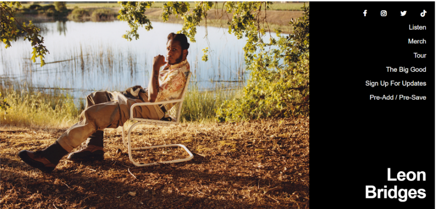
49. Leon Bridges
| Category | Music, Entertainment |
| Learning | Creating a visually striking website for a musician that integrates music, tour dates, and merchandise |
Leon Bridges’ website is an excellent example of how musicians can use Squarespace to create a comprehensive online presence for promotional and commercial purposes. He has also incorporated his merch, which helps him sell and make some profit on the same website.
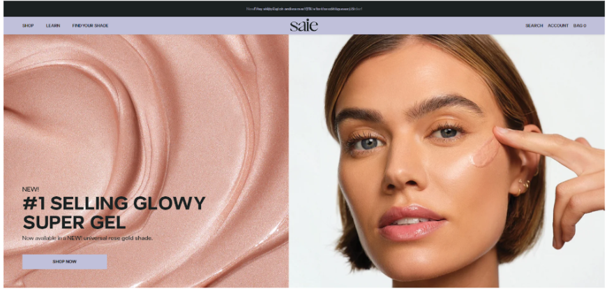
50. Saie Beauty
| Category | Beauty, Commerce |
| Learning | Designing a clean, minimalist e-commerce site that aligns with a brand’s aesthetic |
Saie Beauty’s website showcases how beauty brands can use Squarespace to create a seamless shopping experience while maintaining a solid brand identity and incorporating educational content.
How To Use Squarespace Website Examples?
Use these examples as inspiration to see how your website could look after you have used Squarespace to design it. To make the best of this guide with 50 examples of websites made using Squarespace, understand what each website example in this list includes:
- The website name and creator
- The category it falls under
- A brief description of the website
- Key features that make it stand out
- Lessons that readers can learn from the example
You can use my way to analyze your favorite website.
First, analyze the layout and how it guides the eye. Is it easy to navigate and understand? Then, note the color schemes and how they reflect the brand’s identity. You will then have to pick the color scheme that suits your brand.
Once you have these two things figured out, the whole process on Squarespace will be easy for you to navigate.
Conclusion: Make Your Website With No Coding Knowledge With Squarespace!
These 50 examples of the best Squarespace websites in 2025 demonstrate the platform’s versatility and creative potential. Squarespace allows you to design e-commerce, portfolios, media sites, tech product sites, and much more.
Squarespace is a powerful tool for creating stunning and functional websites across various industries.
The best part is that making a website without coding is a relief for busy business owners and entrepreneurs. Additionally, Squarespace is a blessing for someone like me who is not tech-savvy.
Remember what you have seen in this article, successful Squarespace websites share common elements such as clean design, intuitive navigation, and effective use of imagery.
However, each site also brings its unique flair, perfectly aligned with its brand identity and target audience.
Consider taking advantage of a Squarespace free trial to start creating your impactful website. And if you’re eligible, don’t forget to look into the Squarespace student discount or Squarespace military discount to make your website creation journey more affordable.
